Choosing a Font For Your Logo
As graphic designers, we often get labeled as typography snobs, and I’ll be the first to admit that I am one of those snobs! Typography is more than just letters on a page; it’s about creating a visual language that conveys a brand’s message effectively and aesthetically.
When designing font systems for a brand identity, intentional choices and best practices are crucial. A misstep here can lead to a brand that looks unpolished or inconsistent.
In this blog post, I’ll share my process for creating a font system for brand identity, discuss various typography styles, and explain how to match them with a brand’s unique style.
Note: If you're a self-taught designer, I highly recommend diving into online courses or articles on typography. Understanding its nuances is essential for integrating it seamlessly into your brand designs.
What I Include in a Font System for a Brand Identity
When crafting a brand identity, I select typography for the logo and choose fonts for the client's marketing materials and overall brand presence. If I choose a font that isn’t freely available through Adobe or Google Fonts, I typically purchase it for my client and send them the files once the project is complete.
Since my branding packages are priced on the higher end, I don’t usually pass along the cost of the fonts to my clients. This is just my personal preference. Whatever you decide, ensure you set clear expectations regarding additional fees in your project proposal.
Understanding Font Styles
Typography is a powerful tool for expressing a brand’s personality. Each font style conveys a unique vibe, so it's important to choose typography that aligns with the brand's personality and values.
Here are some of the most common types of font styles:
Sans Serif
Modern, minimal, and clean.
Ideal for brands that want to appear fresh and sophisticated.
Excellent for body copy on websites or in print and for bold headings.
Highly legible and versatile.
Serif
Classic, traditional, and trustworthy.
Great for body copy in print and on websites, as well as headings.
Timeless and sophisticated feel for brands.
Slab serifs, a subset of serif fonts, are more quirky, bold, and confident, perfect for unique brands. Best for headings and logo type, not body copy.
Script
Elegant and feminine, suited for high-end brands.
Sparingly used due to its trendiness a few years ago.
Best for short headings or logo types, never for body copy.
Handwritten
Personal, artistic, and informal.
Should be used sparingly for short headings or logo types.
Decorative
Trendy and dramatic, great for brands that want to stand out.
Best for logo types and headings, not for body copy or large text blocks.
Putting It All Together
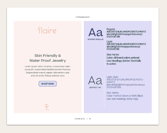
Once you have an idea of which font style you’ll use for your brand’s logo mark, you can choose supporting fonts to use throughout the brand.
One really great tool I use is Font Pair. It lets you browse free Google fonts and generates pairings for you. If typography isn’t your strong suit or you want to see some suggestions for pairings, it’s a really neat tool to check out!
Tips for Pairing Brand Fonts
Separate Logo Font: Consider having the logo type as its own font to ensure it stands strong and doesn’t compete with other brand elements.
Limit Font Choices: Stick to two or three fonts for the brand to maintain a cohesive look. Typically, choose one for headings and another for body text.
Balance and Test: Ensure your fonts balance each other in style and appearance. Test combinations in Adobe and experiment with different weights.
Style Further: Once chosen, style the fonts with caps, italics, or bold settings to provide clear guidelines for your client.
Typography is a cornerstone of a cohesive brand identity, and as designers, we need to be intentional in our font choices and usage.
Hopefully, these tips give you some ideas for using typography more effectively in your branding projects!
Want to Dive Deeper?
If you found this post helpful, check out "Brand Process Savvy." It’s your complete guide to streamlining your design process, charging more for projects, and achieving zero revisions from clients.
This blog post is a lesson directly from the course, so there is even more waiting for you inside Brand Process Savvy!
the one concept method
FREE WORKSHOP
If you are feeling creatively drained and tired of endless revisions from clients - this free workshop is for YOU!
✔️ How to streamline your design process with the One Concept Method
✔️ How to charge $5k+ for your branding projects without having to do in depth strategy.
✔️ How my clients often have ZERO revisions when I use the One Concept Method


